

UX CLIENT REDESIGN


MY ROLE :
UX / UI Designer
UX Researcher
A project in light of a game I enjoy, with my own spin on the client.
This project aimed to restructure a lot of the client IA, to fit more content in less space.
A demonstration of the possibilities of UX, and the far reaches of the importance of design, I took on this project in order to better understand more niche categories of experience and standard interfaces.
THE PROBLEM
As a longtime user myself, the game client was nothing short of familiar to me, and combining this with user research and interview, I wanted to tackle certain frustrations that the client has faced for years now:
1. Unused Features and Clutter
2. Reasoned Nostalgia
3. Misplaced Marketing and Fatigue
THE PROCESS
In order to prevent personal biases, thorough user testing is done, finding pain points for heuristic evaluation, with a new interactive prototype that compares the previous features with their new updated ones.
INSIGHT STATEMENT
How might we improve the client from a usability standpoint, while still respecting the work already there?

USER RESEARCH
Research was done in combination of 1 on 1 interviews, as well as survey based responses, featuring open ended questions and picking amongst insightful qualitative and quantitative answer selections.
Survey participants included current and future potential users.
.jpg)
.jpg)

1-1 Inteviews
5
Survey
Responses
27

RESEARCH RESULTS
Promotion polls included my own social media circles, as well as the League of Legends subreddit.
Interview and polling results necessitated to the ideas of:
1. TOO MUCH CLUTTER
2. FEEDBACK ON FEATURED ITEMS : WORLD'S SHOP
3. VANITY MARKETING FATIGUE
4. CLASHING OPINIONS ON THE UI
HEURISTIC EVALUATION
UNUSED FEATURES AND CLUTTER
REASONED NOSTALGIA
MISPLACED MARKETING FATIGUE

SOCIALS TAB
The socials tab felt increasingly out of place as users played the game more.
It felt more necessary only in the game selection page, rather than being a constant frame of text and micro-interactions on all pages.
You wouldn’t feel the need to see the full list of who is offline when you are browsing the store for instance.

EARLY ITERATION AND TESTING
Testing done after the first round of designs was made possible after providing simple prototype functions to the low fidelity wireframes.
Testing results were slightly more skewed, and less optimistic in terms of designability. Participants suggested the biggest problem facing the client would be lag and connection based issues, something a higher quality UX design would not fully address.
The Interactive prototype redesign aims to lower the possibility of connection based issues by decreasing the amount of content the client needs to present, taking a dive into less is more, and how indirectly, connections and performance would benefit from this, as a backend issue would be addressed by frontend methods.
Once this idea was conveyed after the testing rounds, participants were unanimous in agreement of not only the performance and clarity of the prototype, but the long term goal it had as well.


UI
INTERACTIVE PROTOTYPE


LOGIN PAGE
The Login Page was brought back, with a couple of tweaks.
Users were presented with the option to disable login music and animation.
Users were given the option to stay signed in, this in effect, would maximize the nostalgic and appealing aspect of the login page, without pushing the small inconvenience that it once had.

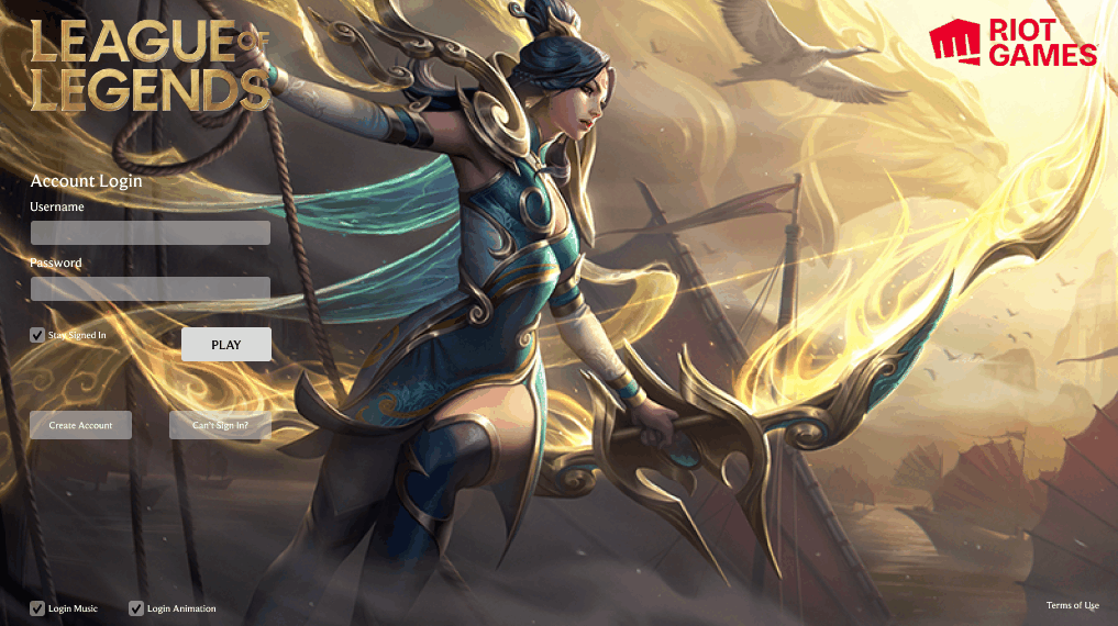
OLD
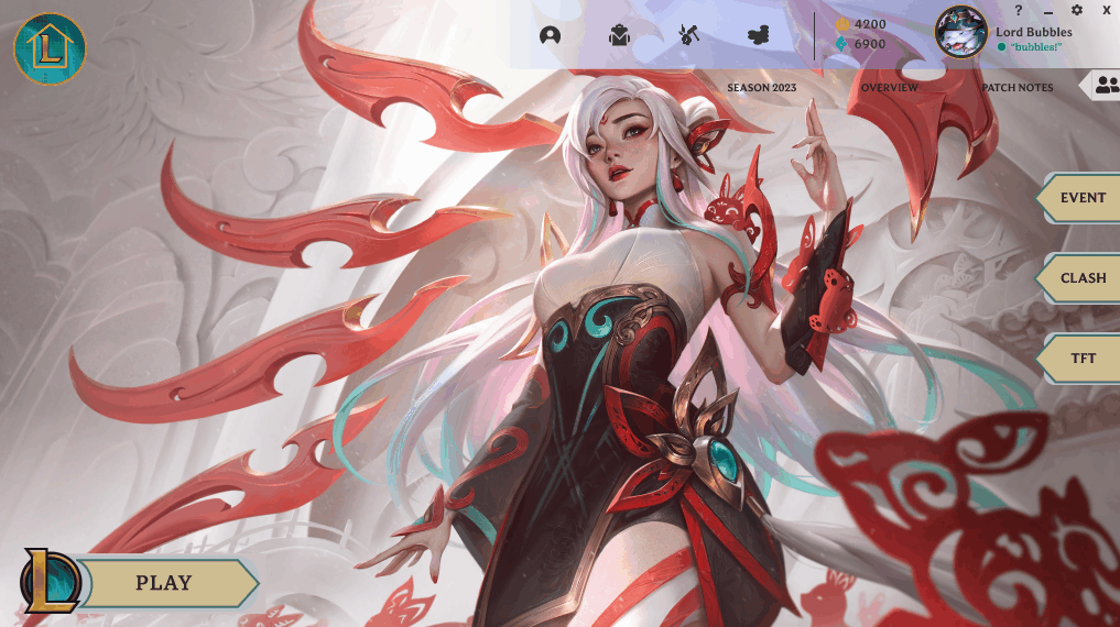
HOME PAGE

The new Home Page came with:
-
A collapsible socials tab
-
Larger play button, the most important element
-
Rearranged secondary buttons: event, clash, TFT
-
Translucent global navigation that did not disturb the event promotion image

OLD
PLAY PAGE
The Play Page was left relatively untouched.
The socials tab was left constant, as this was the page most necessary to see who was online.
As a little nod to my personal decision, I kept the socials tab translucent.
As an artistic and marketing point, I always felt that a dynamic splash image gave the game more lure and spirit than anything else could.


OLD
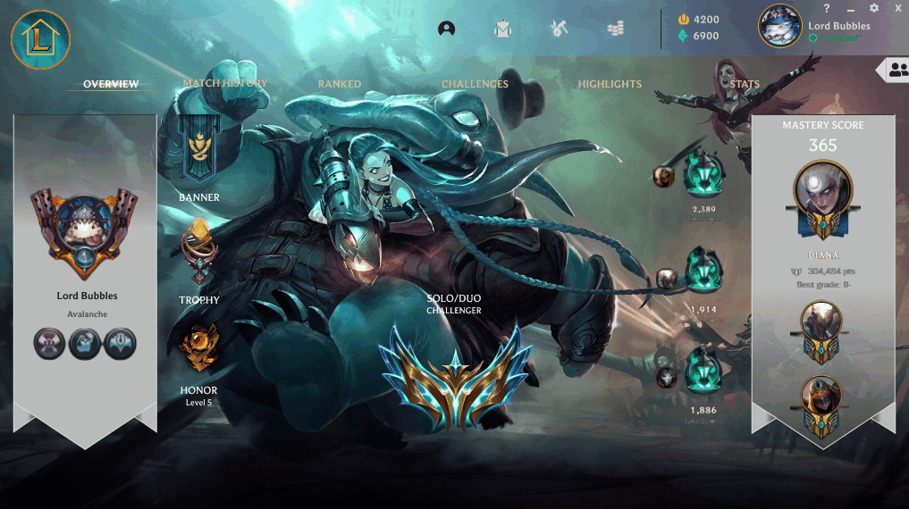
PROFILE PAGE
The Profile page was modified to better reflect certain aspects that were more use-defining.
Profile picture, ranking, and champion mastery were all given equal representation across the board.
While eternals, clash trophies, and banners, as they were not as character defining as the ranking, and champions, were given smaller, but prevalent spacings.

OLD
MATCH HISTORY
The match history integrated new features that would make it more relevant to user interests. Win rates, match grade, and runes are included, and filter options for the win rate, as well as the game mode are made available.
Both the profile page and match history, I must admit are examples of my work getting a bit carried away, and deviating from interview research, as these features were not mentioned then.

OLD
CONCLUSION
Designing this project has played a special part in my journey to UX engineer.
Working with ideas and themes that I had been so familiar with sparked the first glimpse that I had a future that held whatever I wanted it to, that I could choose anything, whether that be something as far fetched as the future of technology, or something as relative as my own childhood game.